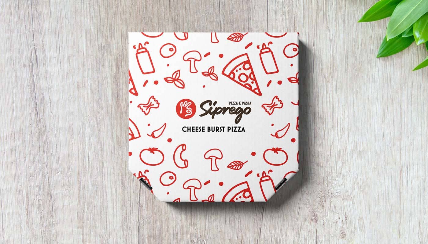
✦ Siprego: Pizza E Pasta was selected to be featured in The Best Pizza Box Designs by DesignRush, a platform known for promoting
best packaging designs. ✦
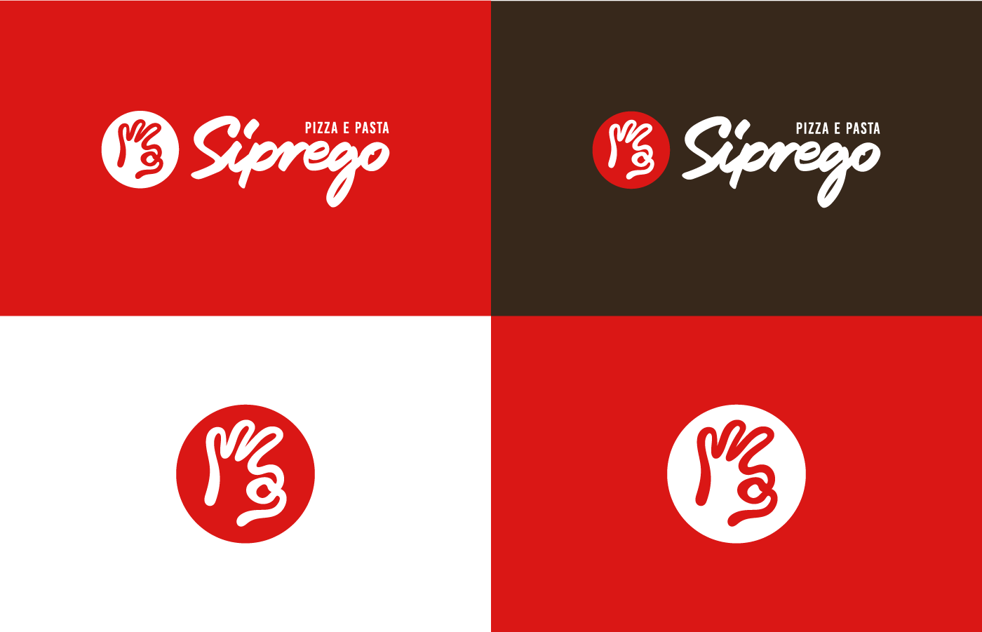
The main objective of this project is to come up with a visual identity that will mix the old traditional Italian style of living with contemporary style and elements. Siprego is a fast-casual pizzeria. I have to develop and extend the logo into a complete brand identity. This includes typography and color palette research, coming up with a pattern and documenting brand guidelines.
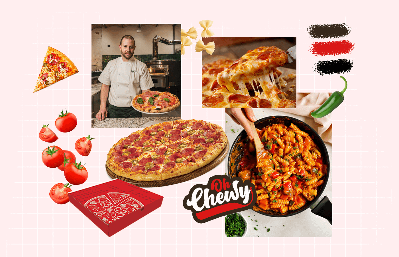
To understand the problem visually, a moodboard was created that reciprocates the brand’s look, voice, and tone.
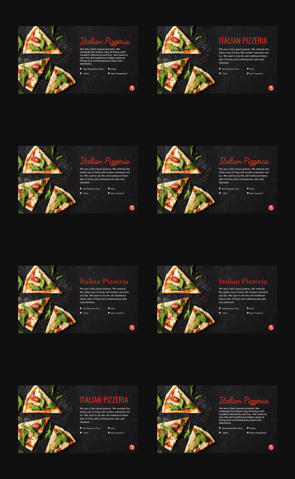
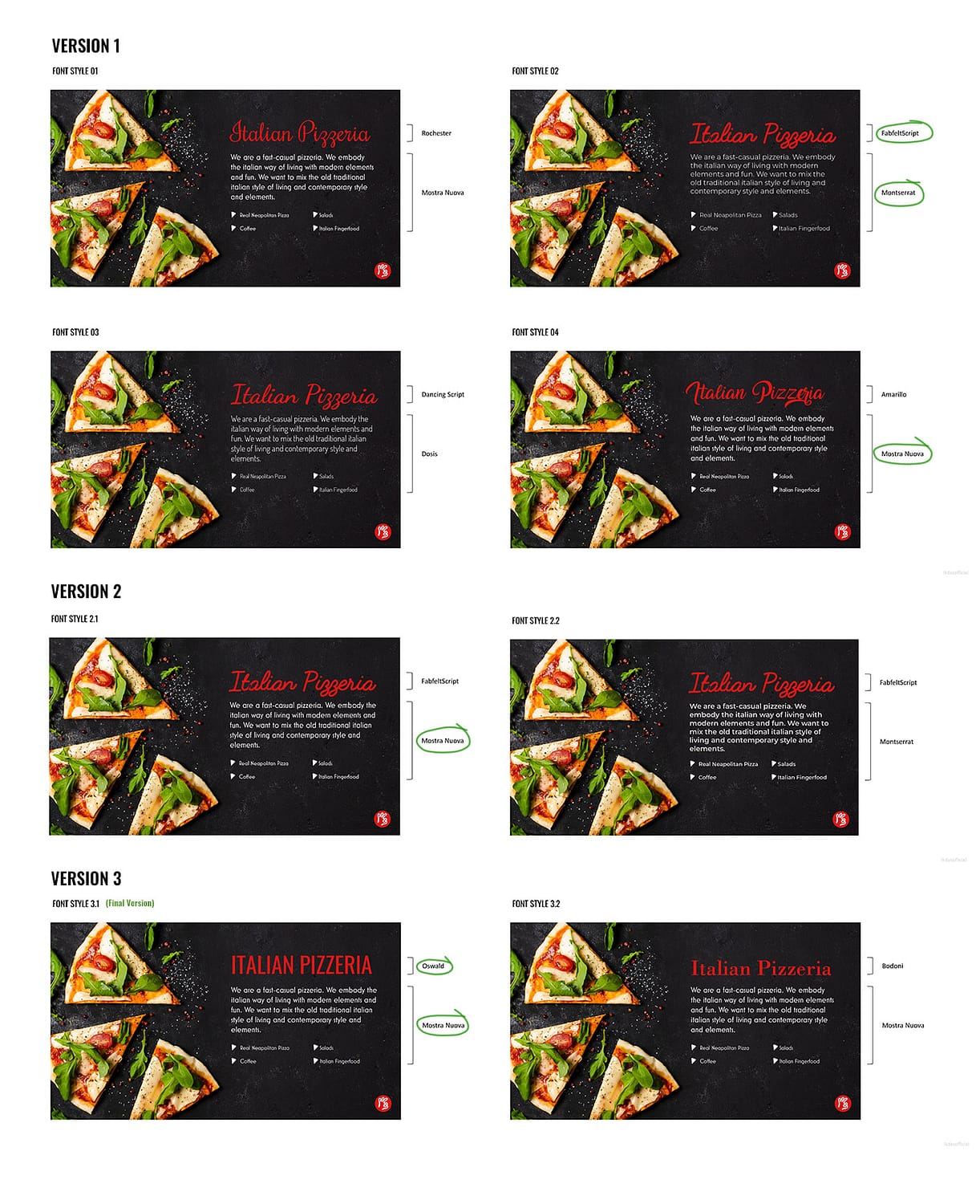
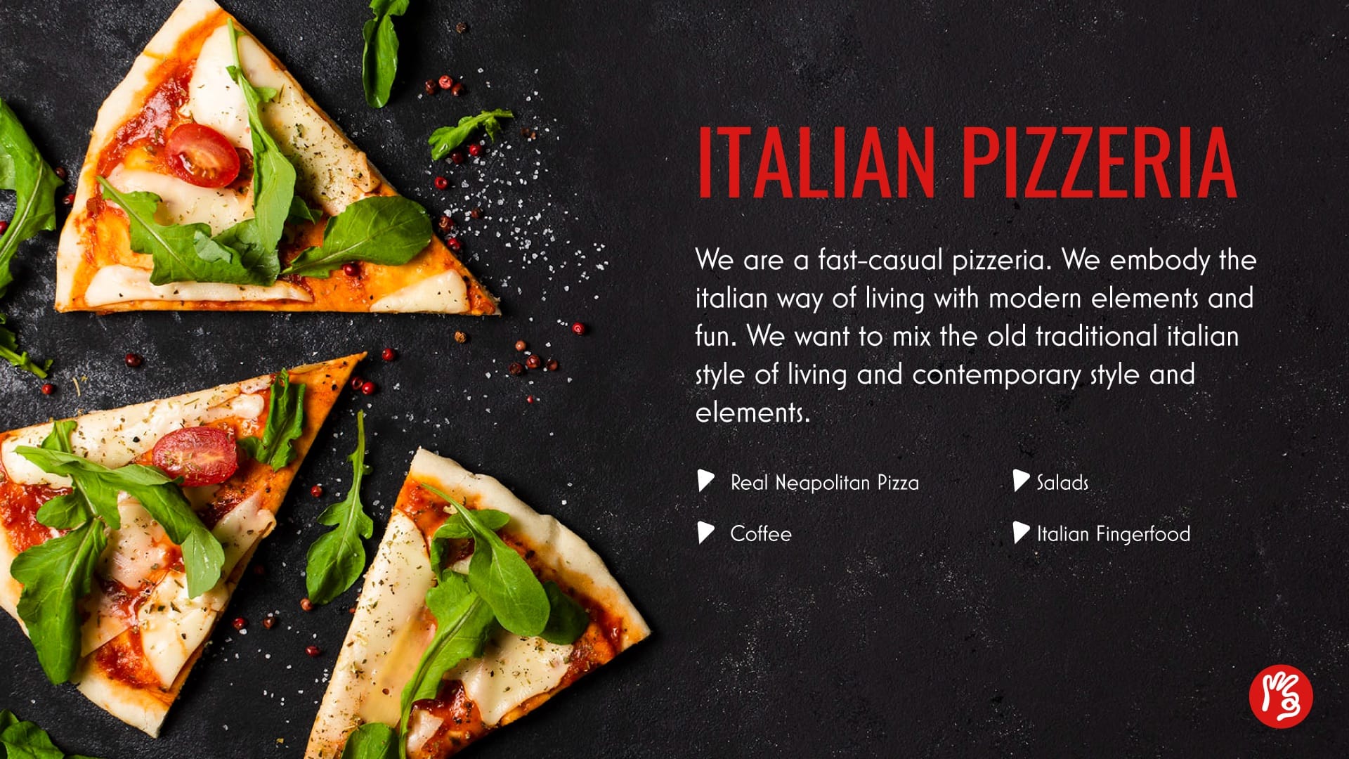
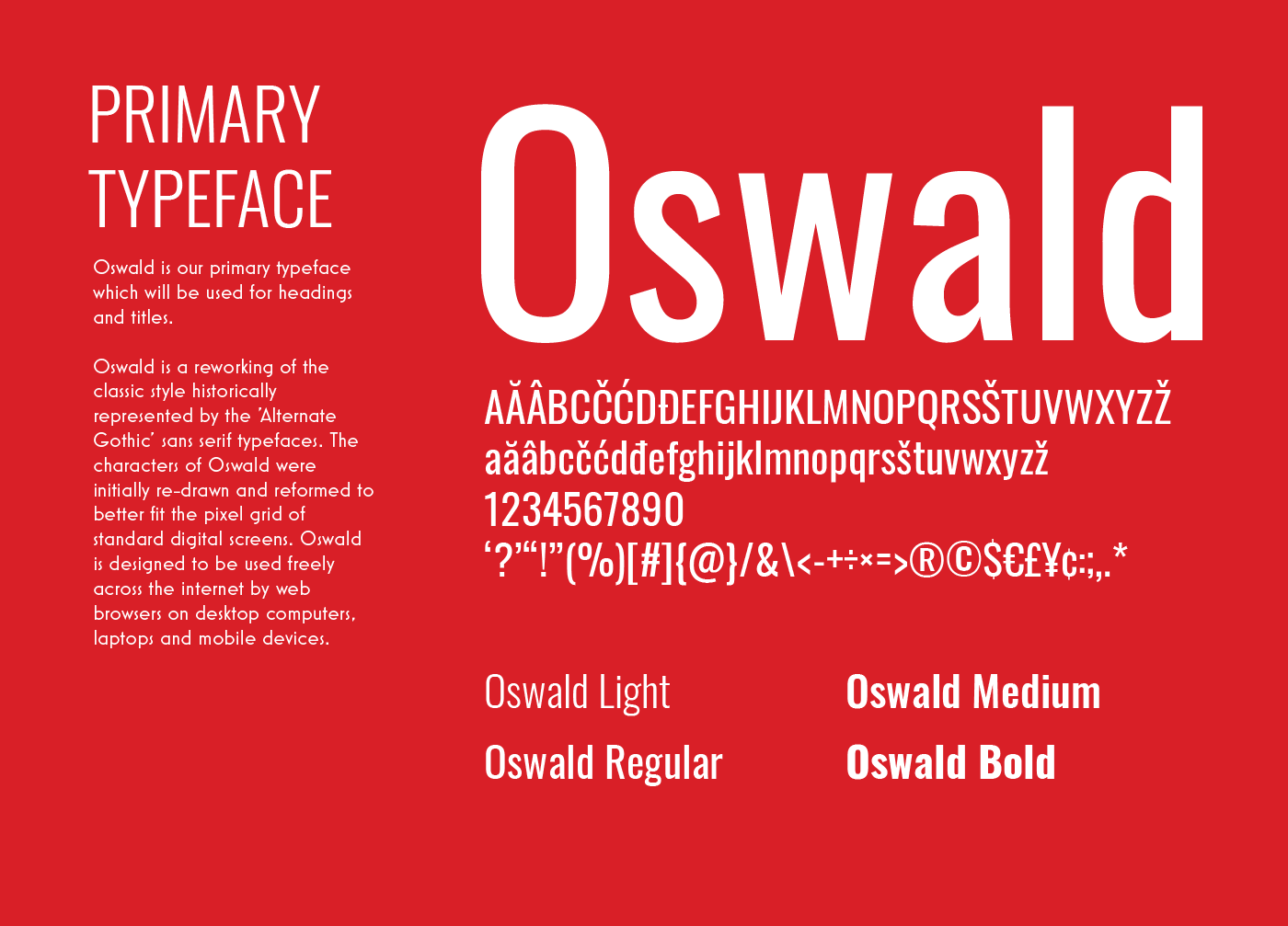
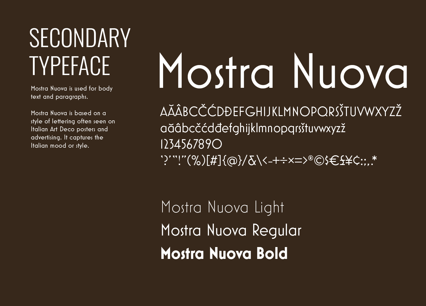
A comprehensive study on the primary and secondary typefaces was done. Out of a few shortlisted typefaces, Oswald and Mostra Nuova were selected. These two typefaces created a sharp typographic contrast and have a historical and classical reference to Italy.
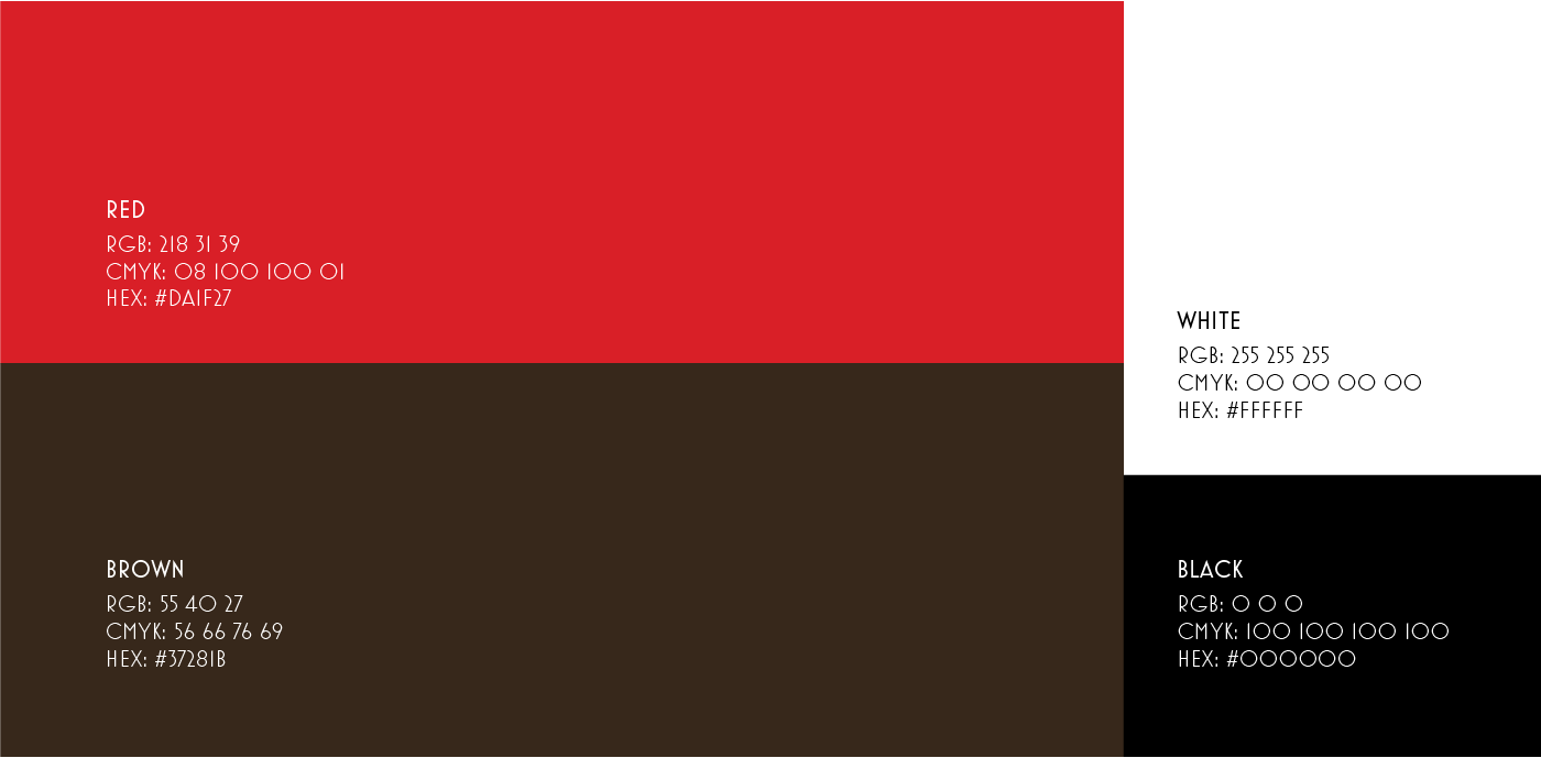
The color palette is inspired by the logo, which closely resembles closely to the analogous color scheme.
The red color will increase appetite and resembles tomato, hot oven and different sauces. The brown and earthy tone sets the perfect mood for a warm and cosy restaurant.
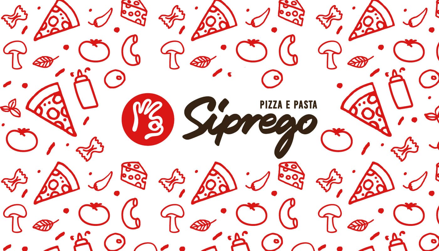
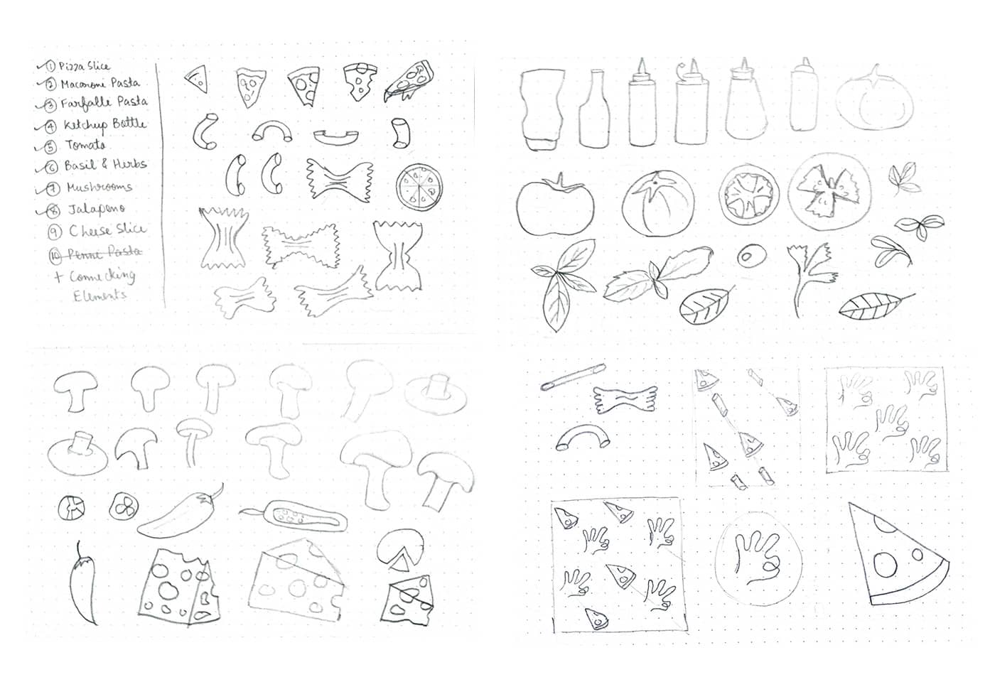
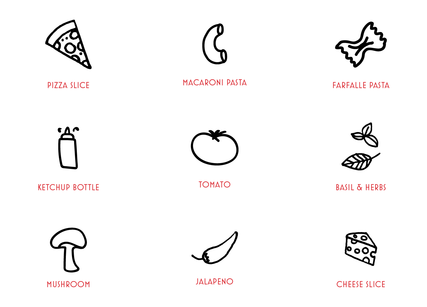
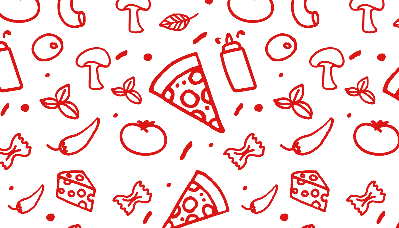
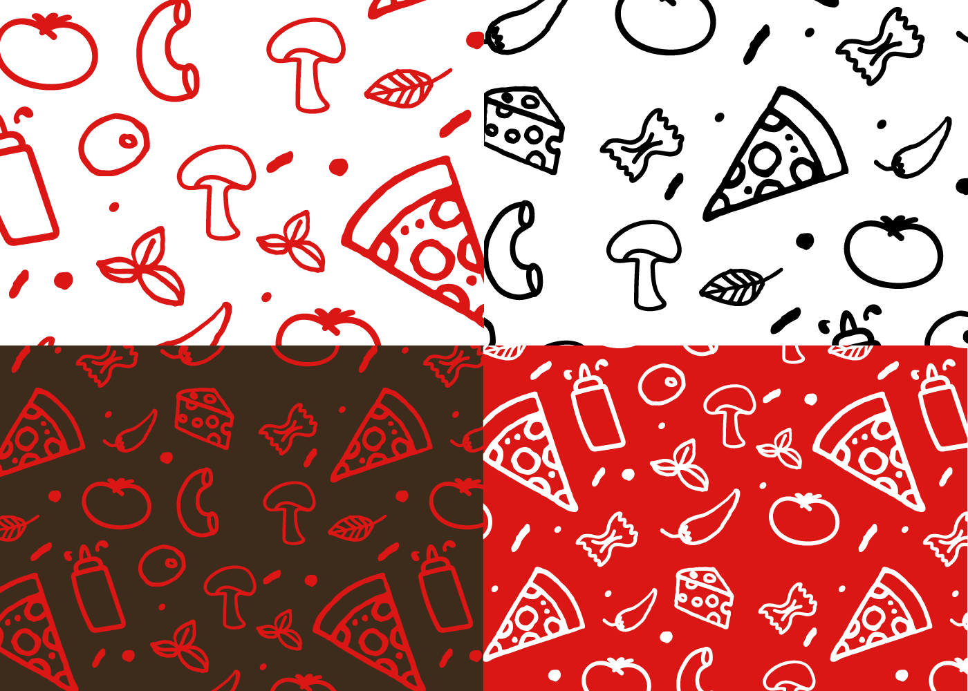
For the pattern, it is composed of the ingredients used to make pizza and pasta – two main dishes of Siprego. To give it a friendly and organic look the illustrations were hand-drawn instead of geometric and mechanical.
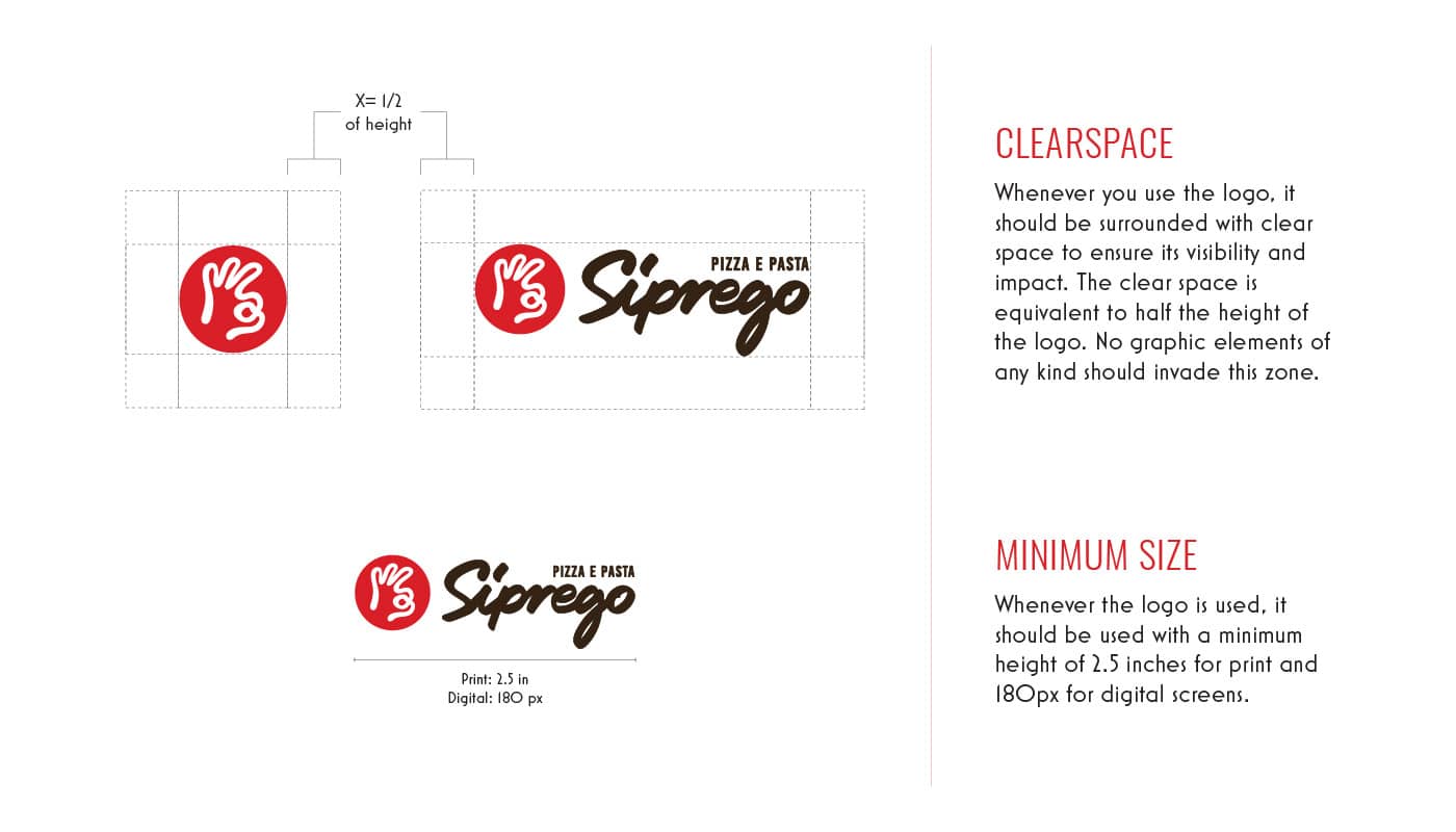
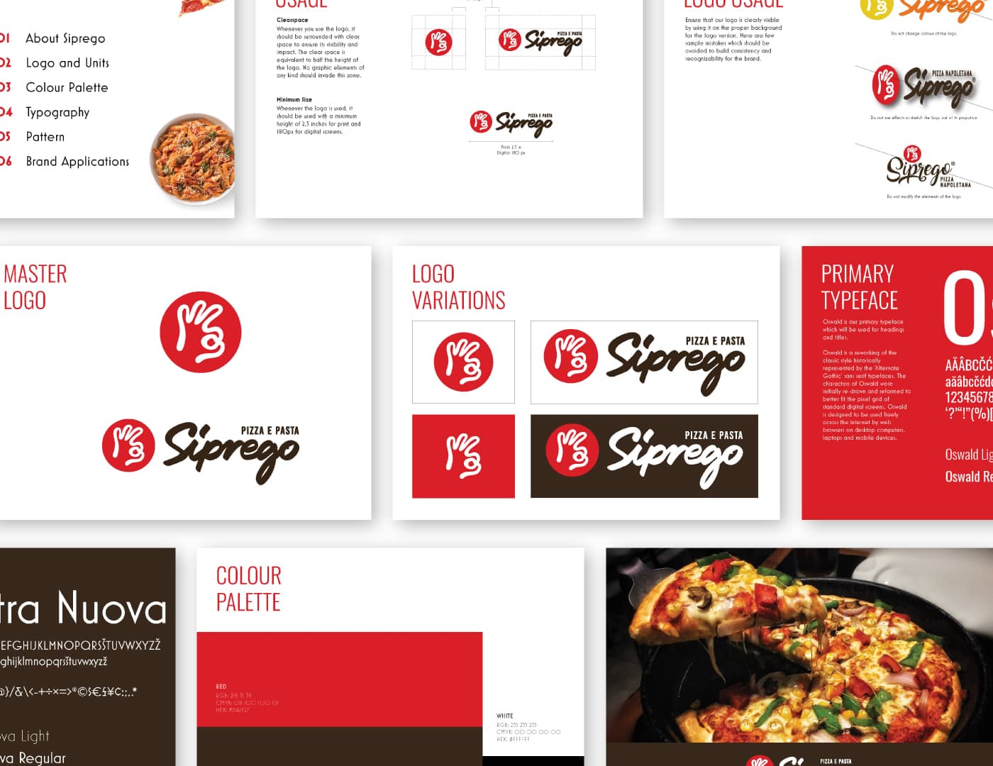
Finally, all these visuals were documented in a proper brand guideline, that will maintain brand consistency in future.


Be it a new project, collaboration, a latest design trend or just want to become friends. Let’s start a conversation!